Blog
Name before Branding
Sometimes we encounter a client that has already decided on a brand name for various reasons. In this case it is because they have used that name on other business ventures. The client has an emotional connection to the name and our challenge is to make a clear connection between the name and what the business does.
The example we use in this post is our client Empire Moringa. Our client being the entrepreneur he is, keenly chose “Empire” with the intention of building exactly that.
His new business would center on the farming of Moringa, a plant used for various medicinal purposes and the creation of several products derived from it. The intention was to introduce these products into the healthy foods and wellness market.
With the awareness of less than ethical practices in the larger food industries, the healthy foods market is a fairly new and trending one therefore we needed to make sure our clients brand expressed trust, freshness.
We began by listening to the client’s ideas and with that commenced to let our creativity flow.
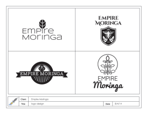
In our first round of logo concepts we created four versions.
- The first one was a stylized interpretation of the Moringa leaf sprouting from a modern minimalist font.
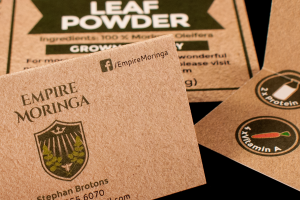
- Logo number two was a crest design that included elements of the Moringa plant along with a honey bee and crown. The crown being a symbol associated with the reign of an empire and the bee we added because the client also was involved in manufacturing honey. We chose an ornate font to match the regal look.
- The third logo focused on a modern stylized crest including a Moringa plant growing from a vast field. A simple banner contained the name.
- Our fourth version was the illustration of a simplified Moringa plant rising in front of the sun. The thinness of the font for Empire was selected to match the outline style of the illustration while the font selected for Moringa was more whimsical and friendly.
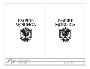
The client received the first round very well. He told us he preferred the second one but asked us to incorporate the field into the crest design.
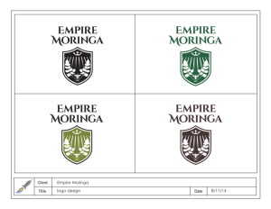
On the second and third round we made minor variations to the sizing of the elements and considered the color palette.There is nothing more inspirational than creating a brand that matches the client’s potential and one their customers can bond with.

